


2025 World Junior Championship Player Cards - Details and Breakdown
Diving into the backend of my 2025 WJC Player Cards

If you follow me on Twitter, I am sure you’ve been hounded by my World Juniors player cards. You can call it the price of admission for following me when I get access to new data. But no good data will stand on its own if you can’t break it down bit-by-bit. I’ll attempt to do that today, in a bit of a quick-and-dirty style. Bear with me, and you should end up with a much richer understanding of what the numbers on this card mean! Stick around ‘til the end for some wide-scope team data. Let’s dive in -
Data Source
This process began with pulling data. This was a multi-faceted process that pulled the bulk of xG, Transition, Zone Time, and Shooting data from SportContract and InStat - two fantastic video services - and then rounded it out with my own tracking of puck-movement, recoveries, puck-battles, etc.. It’s important to note that my personal tracking was used more to correct errors and wonky numbers, rather than directly informing a chunk of the data. That contingency helps us cut through the inherent subjectivity of hand-tracking. One note - this data is all minutes, not just even-strength like you might expect with other cards. Limiting to one strength would cut our ice time substantially, which we can’t afford with data from such a short tournament.
Anyways, data was pulled on two occasions - first after the group stage, to test a proof-of-concept, and then second after the end of the tournament. The nice thing about pulling from multiple sources is that it forced me to walk through each stat and how it was tracked, which limited any necessary cleaning due to things being tracked as percentages or formatted as time (ie, 2:53 minutes of ice time should instead be 2.88). The only bulky cleaning needed was ensuring that some of the puck-based stats - recoveries, battles won, passes - were properly separated by zone (O-Zone, N-Zone, D-Zone) and strength (Even, Kill, Peeper).
This process gave me over 100 columns of raw data. I then adjusted, essentially, every counted stat into a per-60 rate to sort of level the playing field in such a diverse environment. We can debate the effectiveness of a per-60 rate, versus a comparison to average or something adjacent - it’s a worthy discussion when working with players who played so few minutes. But that rate is a nice and simple adjustment, that we can rectify further with some more filtering later on.
Percentiles and Correlation
The per-60 data is our oil… our watercolor… our, acrylic? If you swing that way. It’s the substance that can paint our picture, and we start doing that by using my favorite adjustment - percentiles. I’ve recently been a big fan of lifting out how stats compare to the average recorded by players at the position. We can’t analyze Ryan Leonard recording 2.72 xGF/60 at a simple glance - but saying that his xGF/60 ranks in the 86th percentile of all forwards gives us an idea of how Leonard actually performed in that category.
But here’s the thing - my laptop may explode if I try to go from raw data to per-60, then per-60 to percentiles for all 100+ stats. So, to be a bit more honest to our process, not all stats were adjusted to percentages. How did we determine which stats to adjust? Crudely!
The ultimate question we’re trying to answer at this step is what stats correlated most with actual results? To do that, I quite simply looked at correlation between every stat, and Team Wins per Games Played. Adjusting this to per-GP helps us filter out obscenely high stats from eventual healthy scratches… Joey Willis, Herman Traff, Porter Martone. This is not a perfect system, but it is a system that gives us some semblance of comparison between all of these numbers. Here’s what I found:

Okay this is a lot. I encourage you to not dive into the specific meaning of each variable, each correlation, the distinction between F and D, what they mean… there requires a bit of context to really sift through these results properly. I’ll try to cover some of the need-to-know context -
First, most of this checks out, right? Players who played with the lead, were on ice for more goals-for than against, scored, and got shots on net won more games than they lost. And vice versa. Of note, the distinction between ‘Time of Possession’ and ‘Time with Puck’ is a strange issue of definitions between multiple data sources. For the sake of brevity across the industry, we’ll stick with ‘Time of Possession’ - which I was able to better level out between sources and verify with my own numbers.
Another note, there are some stats in our final card that aren’t listed here. Entry/exit data being a good example. We still want to tell a reasonable story in our visual, so we’ll include some additional numbers towards that end - but don’t worry, we’ll make sure our final numbers still properly represent each player.
The TOI Issue
Alright, now we have our percentiles, and we (generally) know which stats matter most - but that only gets us 80% of the way. There’s unfortunately still a big roadblock in our way. To identify it, let’s take a close look at New Jersey Devils prospect Herman Traff.
Traff was an extra forward for Sweden. He was healthy scratched in the medal game. Those facts limited him to just ~48 minutes of total ice time at the tournament. But - get this - 26 of those minutes (54%!!!) were spent in the offensive end. He started 21 of his 75 shifts with an offensive-zone draw. The exact zone start breakdown was 21 OZ, 8 NZ, 9 DZ, and 37 on-the-fly. That is some incredible sheltering, and that distribution of offensive-zone time versus defensive-zone time made Traff the clear front leader in both stats.
But we can’t genuinely say that Herman Traff controlled the puck out of the defensive-end, and into the offensive-end, better than anyone at the tournament. That may be what the numbers say, but it’s a facetious result of us pulling things into a rate stat. So, to properly visualize who actually helped their team into the O-zone the most, we have to do some quick adjusting…
Rather than looking at zone time as a per-60, we’ll address this problem by looking at zone time as a percent of time on ice. This is simply dividing everything into (OZ Time of Possession / Total TOI) and vice versa for DZ. But that, again, doesn’t address our issue - so we have to also reward Total TOI as its own stat. We’ll repeat our usual process - clean data then pull it into a percentile relative to position group. That lands us with three stats that we can average out into a general “Ice Time Score” to show if we succeeded in our mission. A reminder, this “Score” contains three percentages:
Percent of ice time spent in the O-Zone, relative to position average
Percent of ice time spent in the D-Zone, relative to position average (This stat is inversed, since less time in the DZ is better - simply (1 minus %)).
Total time on ice, relative to position average
Here's the top 20 of our lil “Score”:
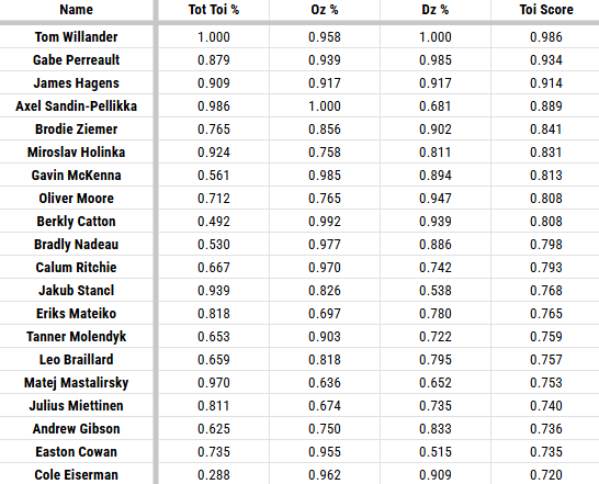
Theoretically, these are the players who pushed the puck out of the D-zone, into the O-zone, and were utilized most by their team. We can still see some inherent bias - Eiserman only being deployed when the puck is north of the ice is a good example - but a player like Traff checks in at 139th on this list, rather than the #1 spot he held without including total Time On Ice. So we’ve, generally, achieved our goal of rewarding the players who actually pushed the puck up the ice.
A small note here, you saw ‘Time of Possession’ as one of the stats most correlated to success earlier. Making these adjustments improves that correlation from 45.9% to 49.6% - more evidence that we’re generally moving in the right direction.
While we’re here, I also identified “Roles” based on Time-on-Ice per Game. This was very crude and subjective - but I took every player’s ice time per-game and grouped it into multiple levels. Here’s each role, and the TOI minimum that defines it:
First Line F (>17.5 Mins); Second Line F (>15 Mins); Third Line F (>13 Mins); Fourth Line F (>9 Mins); Extra F (>0 Mins)
First Pair D (>20 Mins); Second Pair D (>17 Mins); Third Pair D (>13 Mins); Extra D (>0 Mins)
Building Our Cards
Okay, okay, okay… we’ve landed with a whole lot of stats and numbers - that we’ll cut down pretty substantially to build our cards. We’ll go from >100 stats to just 23, selected by what actual correlates with results most. Our chosen numbers (and the grouping I’ve placed them in) are:
Scoring
G/60, A/60, P/60, Plus-Minus/60
Transition
Entries/60, Controlled Entries/60, Exits/60, Controlled Exits/60, Entries Allowed/60, Controlled Entries Allowed/60
Expected Goals
xGF/60, xGA/60
Possession
CF/60, CA/60, Recoveries/60, Battles Won/60
Shot Assists
Primary SA/60, Secondary SA/60, Rush SA/60
Time of Possession
O-Zone % of Ice Time, D-Zone % of Ice Time, Total TOI %
(These are the numbers in the white sheet above)
Passing
Completions/60
(We had plenty of pass data to play around with. Ultimately, we look at who completed their passes more than others?)
I try to walk you through my processes as stepwise as I can. And at this point, my next step was to spend a metric ton of time trying to figure out how to organize these stats into a clean, organized visual. I am not a creative, so this process was far from fine.
Even after organizing all of the numbers properly, they weren’t telling an easily-absorbable story - like we’d want with such simple cards. For that reason, I decided to also create “Overalls”, that very simply averaged percentages across different stats. That’s what ya see at the top of the cards - and here are the numbers that go into ‘em:
Offense
G/60, A/60, xGF/60, CF/60, Battles Won/60, All Shot Assist Info/60, O-Zone % of Ice Time
Defense
Entries Allowed/60, Controlled Entries Allowed/60, xGA/60, CA/60, Recoveries/60, D-Zone % of Ice Time
Possession
CF/60, CA/60, All Shot Assist Info/60, O-Zone % of Ice Time, D-Zone % of Ice Time
Transition
Entries/60, Controlled Entries/60, Exits/60, Controlled Exits/60
Ha, now this is where things get a tad messy. We run the risk of a lot of duplication with these “Overall” values. That’s why things are spread between stats a bit, and why Points/60 aren’t included. The goal here is to not reward players twice for any one stat - including P/60, a good example, would give all scorers an inherent boost over anyone else.
For this same reason, we also won’t include ‘Possession’ in the calculation of an “Overall Score”, since that would duplicate pretty much all of those values. Instead, our “Overall” is a (cleaned up) average of the Offense, Defense, and Transition values - hence why it’s listed as “Calculated Overall” on the chart.
Final Cards and Inherent Flaws
Alright, with the overalls cleaned up, we land with our final cards! Check em out -

Gorgeous. I think they landed really well - and now you know all of the details that went into ranking Osmanis as one of Latvia’s top forwards.
I am proud of these as strong encapsulations of data that is not widely available. We’ve compiled good info, rooted in what actually impacts team wins, and made it easily visible. Goal achieved. But these are far from perfect cards. There are a lot of inherent flaws, stemming from a mix of poor stat selection, implicit correlation between stats, and minimal sample size, to name a few. I don’t want to leave these without acknowledging room for refinement or improvement, so let’s hit on that real quick:
Including scoring data is always a mess. If you put me on a line with Wayne Gretzky, I’ll get a few assists because I threw the puck to Gretzky in the D-zone and he went coast-to-coast. xG avoids that, but then we run into issues with xG connecting to Corsi. I could avoid these issues by chopping up Shot Totals into on-net versus missed - but that’s a lot of work when Corsi is easily recognizable. Including Shot Assists in three parts really reward the passes leading to a shot, which is why Easton Cowan ranks as Canada’s top forward over Berkly Catton - because the passer gets a little boost when the shooter shoots. And chief among it all, players record higher stats when their team records higher stats - there is a core team bias in the data that’s near impossible to filter out with so little TOI.
There are probably plenty of other flaws. We can talk shop over entries/exits being improperly tracked, we can call my Zone Time adjustments off-kilter, we can call the “Overall” scores misaligned. It’s all fair. And those flaws are important to keep in mind.
The best player at this tournament (Tom Willander, shoutout Vancouver) maxes out the categories. But we can’t simply look at who maxes out each category and walk away with “Player X is better than Player Y because his Overall was higher.” Let me be clear here, no stat in hockey can be analyzed that simply, because anything involving humans is inherently subjective. I encourage everyone to think deeply about what each stat means, and how they paint the story of where a player was involved or how they made an impact. Such a wide array of stats gives us a normally-elusive ability to do that.
Team Leaderboards
Alright, with my process, my cards, and my soapbox out of the way - let me immediately walk back that whole “don’t oversimplify these numbers” for the sake of some fun. I appreciate you making it this far into the article, and as a small reward - here are the lineups of the top-eight countries from this year’s tournament, coupled with where each player ranks in the “Calculated Overall” that we created.

These lines aren’t perfect - it’s all from the subjective “Role” assignments that we made earlier. But this gives us a great look at overall depth, lineup decisions, and general team quality.
I’m hoping to release public, interactable versions of these cards soon - but am still fine-tuning some data protection. I’ll post those as a community note on this newsletter when they go live. Thank y’all as always for following along - I’m eager to hear some of the feedback to this process!